For the low price of only TWENTY TWO THOUSAND AUSTRALIAN DOLLARS (that’s USD $16k) you can be the proud owner of what is arguably the ugliest bike that Trek has ever produced. Introducing the Trek 50th Anniversary ICON Edition Madone SLR 9 AXS Gen 8.
Designer: What colour palette would you like?
Trek: All of them.
It certainly stands out, I’ll give it that! Expect to see this paint scheme on the bikes ridden by Lidl-Trek at the Tour de France and Tour de France Femmes later this year. Thankfully the “First 50 ICON” is limited to a public run of only 50 bikes (although a slightly cheaper replica is available) so you’ll hopefully never have to burn your retinas seeing on one in real life.
To be fair to Trek, each of the little square logo designs that are haphazardly stuck all over the frame represent a part of the company’s history. From it’s founding partners, to the introduction of OCLV carbon, to the People For Bikes program. There’s even a subtle nod to the Lance Armstrong days, something that is mostly swept under the rug by Trek these days.
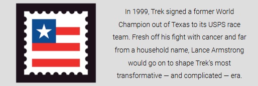
If you ask me (which of course, you did not) Trek frame and paint scheme aesthetics peaked some time in the early 2000’s with the truly iconic US POSTAL team bike designs on their 5200/5500 series of road bikes. 😉


You sure that isn’t an April Fool? 🤔 Kind of suits the Lidl sponsorship though 🤣
I think they dealt with the Lance Armstrong situation very well. It would have been easy to ignore it but instead they’ve accepted and dealt with it 👍
LikeLiked by 1 person
I guess at least it will certainly stand out from all the other bikes in the peloton!
LikeLiked by 1 person
Maybe they got a quilter to design the colouration haha
LikeLiked by 1 person
They asked every Trek employee to get their Nanna to knit a square each? 😆
LikeLiked by 2 people
The good news is those fifty people will probably never ride them, so we won’t have to see them. They’ll hope for them to be valuable to resell for the 100th anniversary (if they and Trek live that long).
LikeLiked by 2 people
They’ll be hanging on the wall in some multi-million dollar 50th floor penthouse apartment with sweeping views of the city?
LikeLiked by 1 person
I’m fine with commemorative and ugly paint schemes. I would have gone with a bit more flash. I’m not a fan of the flat black scheme that has been the trend of far too long. For years my favorite color for a bicycle was one solid red color in Ferrari or Ducati red. White lettering. Nice, but boring with there are so may options. The old team Pinarello from 1983 was a four color bike with black lettering. The factory added sparkles the 1985 in a tricolore scheme. I didn’t care for the sparkles so much, but the clear coat was welcome over the peeling stickers and decals. A couple of months ago I ran into the local Pinarello rep on a Matt purple bike with gold lettering and super bling deep rim wheels. Quite pretty. As to this Trek I won’t buy, I’m not in the pay grade that allows collecting anything more than dust. I’ll have to remain content with the black and red Pinarello F7 in muted sparkle.
LikeLiked by 1 person